Casestudy
2025
NUVama wealth
Corporate Fixed Deposit Investment Journey
How redesigning a regulated, interruption-heavy investment flow for Relationship Managers resulted in a 32% increase in investment rate by rethinking continuity, not screens.
Role
Sole Product Designer
Timeline
4 Months
platform
Web & Mobile
Users
RMs, Wealth Managers
Context
A growing product with a broken journey
As demand for Corporate FD investments increased at Nuvama Wealth, the business moved to an in-house platform for Relationship Managers to place orders on behalf of clients. The existing journey no longer reflected how the process actually worked; it was lengthy, repetitive, and interruption-heavy, especially during order verification.
I was brought in to redesign the Corporate FD journey across web and mobile; making a regulated process feel faster, cleaner, and easier to complete without eroding trust.
Research
Understanding the real friction first
I started by sitting with Relationship Managers and Wealth Managers to watch them actually use the platform. Not describing it, but doing it live. I also studied adjacent product journeys and used competitive research to understand how similar investment workflows were structured elsewhere.
What became clear quickly was that the problem wasn't any individual screen. It was the rhythm of the flow itself.
“I have to stop three times just to verify one order. By the time I'm done, I've lost the client on the call."
Design Insight
Verification was scattered. Creating multiple pause-and-resume moments that broke RM focus and client trust.
"The forms ask me for the same information in two different places. I never know which one actually matters."
Design Insight
Duplicate data entry created confusion about authority and correctness — serious in a regulated financial environment.
"When I come back to a paused order, I can't tell what's been confirmed and what still needs action."
Design Insight
No clear status visibility — RMs couldn't resume confidently, leading to repeated restarts or errors on long-cycle orders.
"Mobile is unusable for this. I only try it when I'm forced to."
Design Insight
Duplicate data entry created confusion about authority and correctness — serious in a regulated financial environment.
THE FLOW
The new workflow
The original journey had verification events scattered throughout; triggering OTPs and approval checks at unpredictable moments. The redesign moved all verification to a single consolidated checkpoint.

What I changed
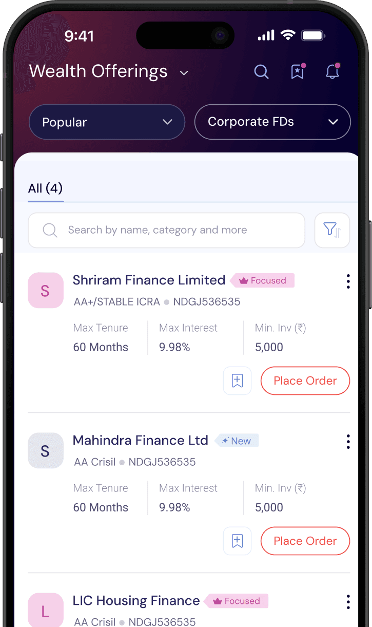
Clear Entry Point
A dedicated listing page for Corporate FDs. Simply select the preferred scheme and then select your client.
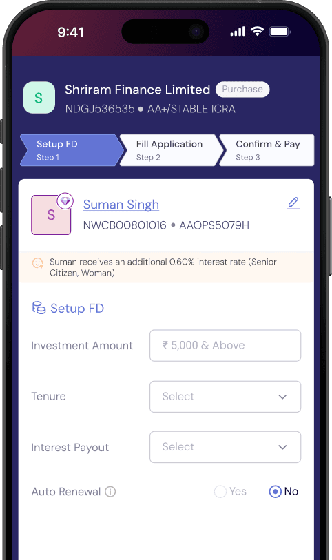
Streamlined Workflow
3 quick and easy steps to place an order for a fixed deposit.

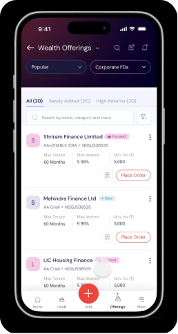
End-to-end flow
This is what relationship managers now use everyday. A workflow that is quick, clean and meets all the compliance requirements, resulting in a journey that clients trust.
The outcome
32%
Key learnings
Simplifying a complex workflow is rarely about removing screens. More often, it means identifying where the real effort lives and redesigning the flow around that. The biggest opportunity here wasn't the UI — it was interruption architecture. I'd push harder on post-launch qualitative research next time, and advocate earlier for a shared component library between parallel product flows.
Shrestha Gaur
2026
made with care